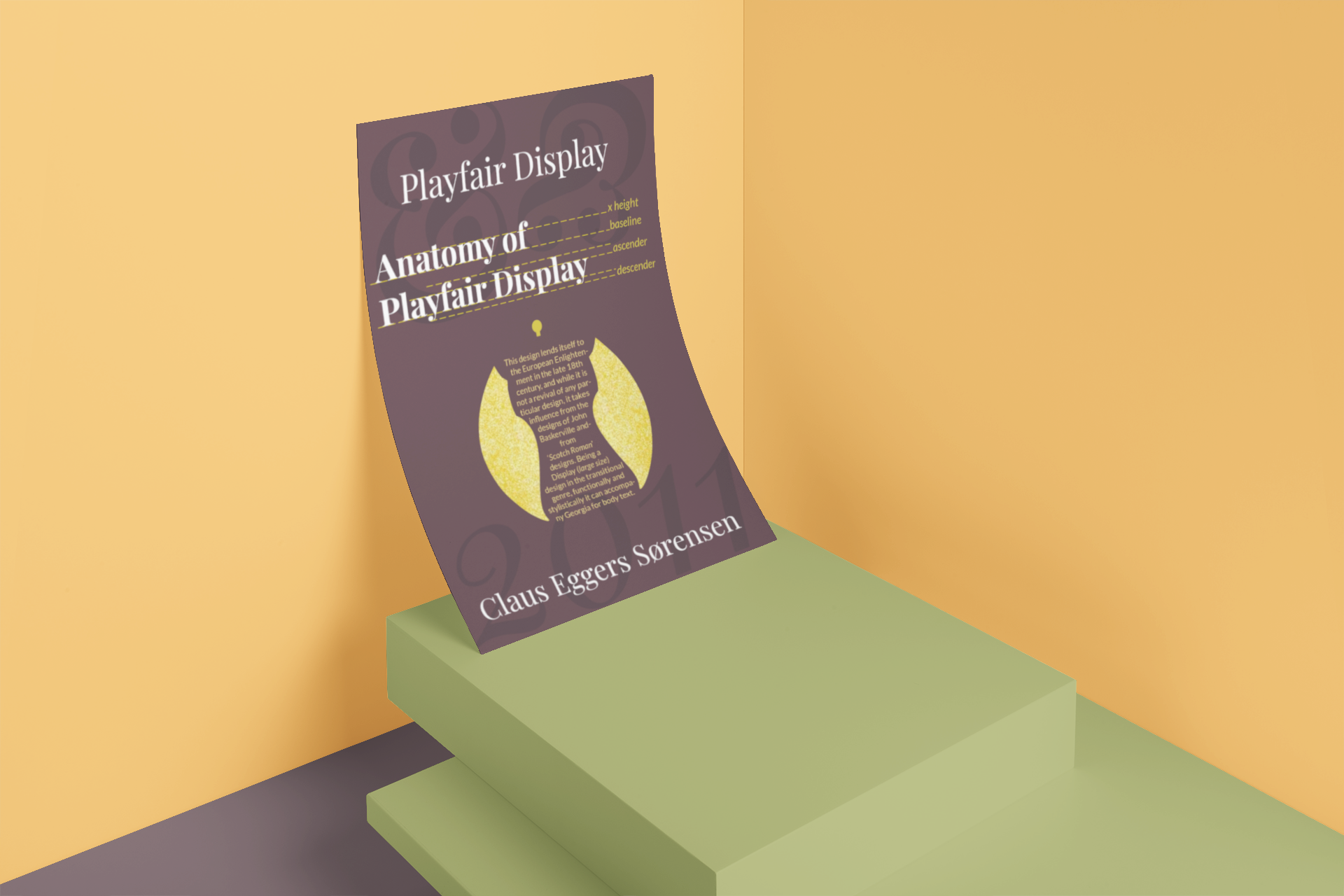
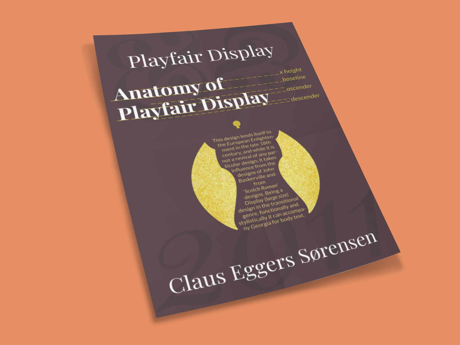
The typography feature poster highlights the captivating typeface, Playfair Display, designed by Claus Eggers Sørensen in 2011. With a nod to the European Enlightenment era of the late 18th century, this design exudes an air of sophistication and elegance. While not directly inspired by any specific typeface, Playfair Display draws influence from the works of John Baskerville and the distinctive 'Scotch Roman' designs.
As a Display typeface, it is ideally suited for larger sizes, allowing it to make a bold statement. Functionally and stylistically, Playfair Display complements Georgia, making it a suitable choice for body text. The poster showcases mandatory elements, including the title, designer's name, and year of creation, as well as labeled anatomical parts and/or letterform characteristics, all coming together to celebrate the timeless beauty and versatility of Playfair Display.