Situation:
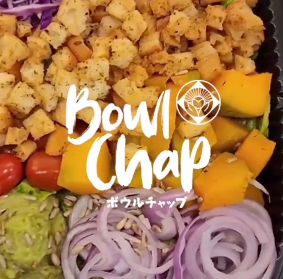
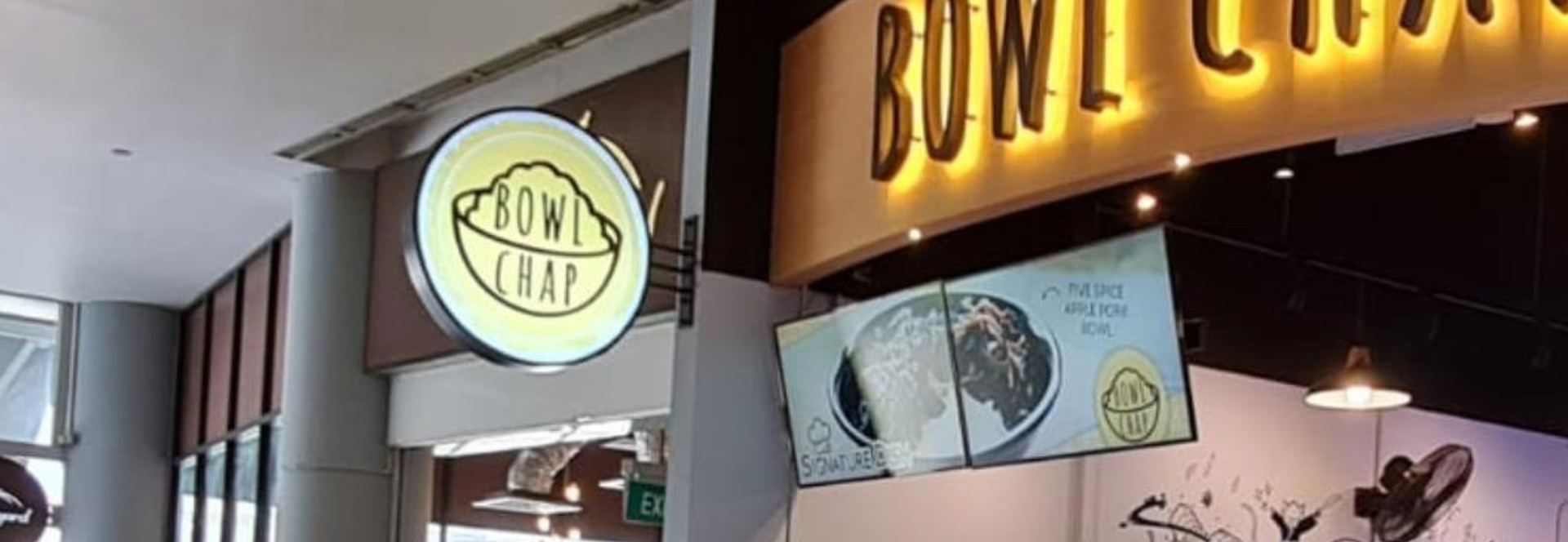
Bowl Chap serves Japanese Inspired Fusion rice bowls with a local – twist. They started as a hawker center stall at the Ayer Rajah Food Centre and are now at Fusionopolis. While they have a logo, it is not consistently applied across their different channels and collaterals.
Task:
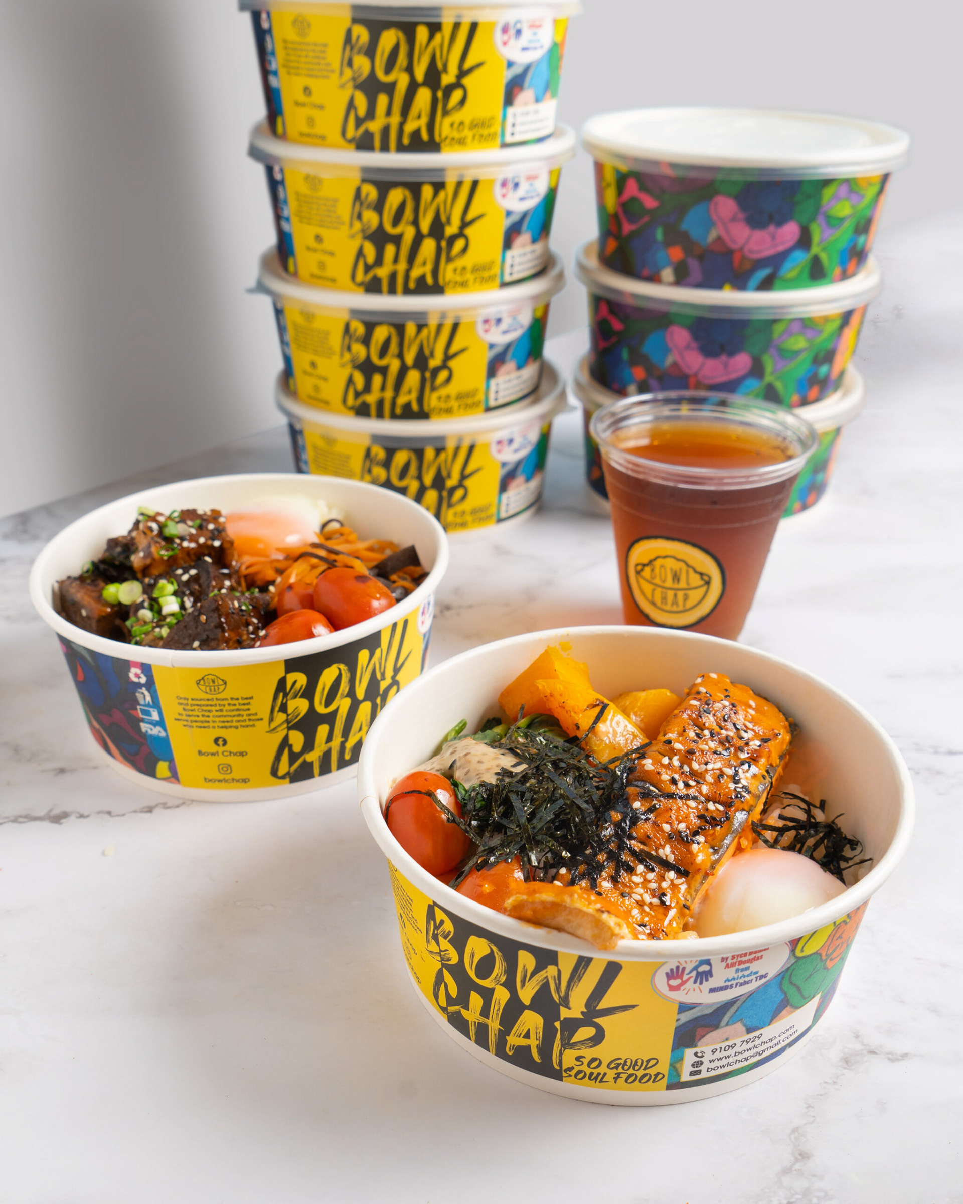
The Project was undertaken to design a logo for Bowl Chap that highlights their unique food concept. The logo should be able to be easily applied in multiple settings such as their website, on their food and drink packaging and on social media posts.
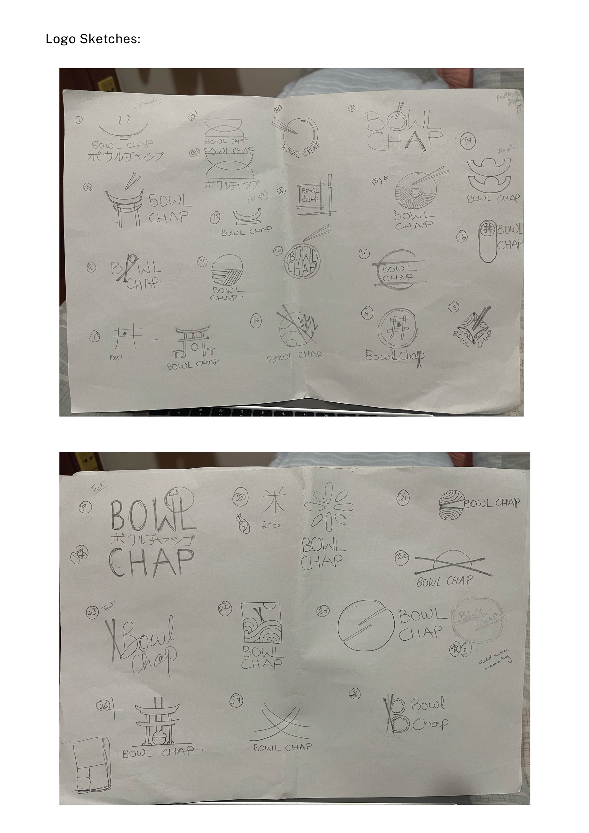
Sketches of 20+ logo designs playing around different aspects of the Bowl Chap theme.
Action:
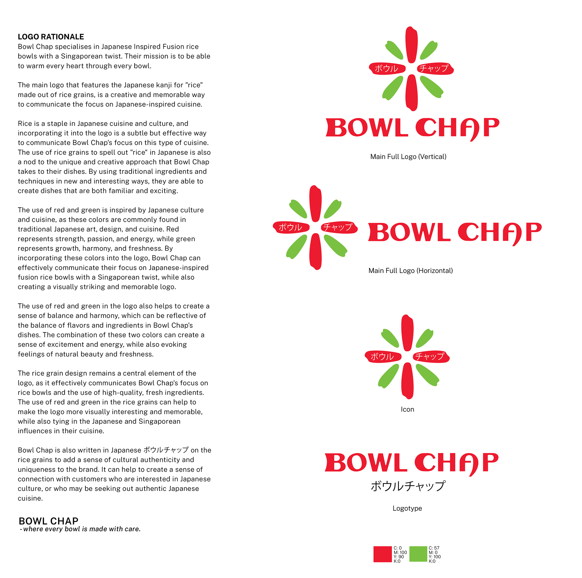
Throughout the creative process for Bowl Chap's logo, I diligently crafted more than 20 unique sketches. My goal was to capture the essence of their Japanese-inspired fusion rice bowls with a Singaporean twist.
Each sketch delved into different visual concepts, exploring diverse representations of rice grains, bowls, and Japanese kanji symbols. Some designs incorporated traditional Japanese art motifs to resonate with cultural authenticity.
With every iteration, I sought to strike the perfect balance between tradition and modernity, aiming for a compelling logo that would truly warm hearts with each bowl.
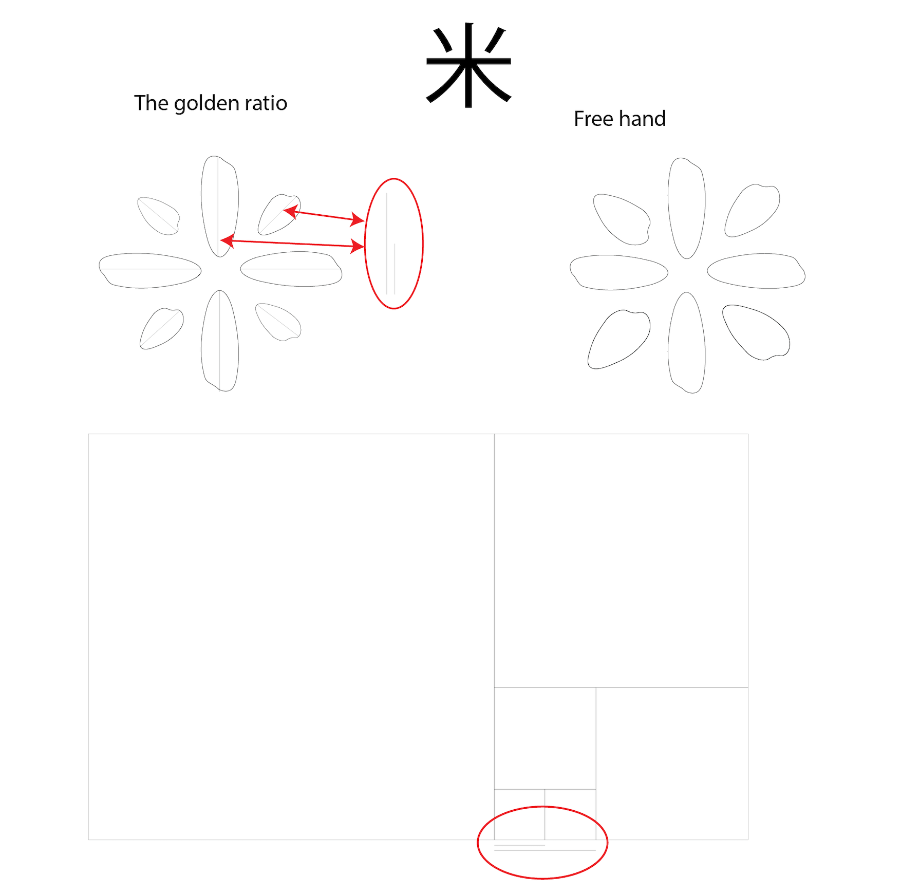
After finalizing the logo for Bowl Chap, I employed the golden ratio to enhance its visual appeal and harmony. By analyzing the logo's elements, I identified key proportions and relationships, ensuring they adhered to the golden ratio principles. The logo's dimensions, spacing, and alignment were adjusted accordingly, achieving a sense of balance and proportion that naturally draws the viewer's eye.
Implementing the golden ratio subtly amplified the logo's aesthetic allure, instilling a sense of organic beauty and pleasing symmetry. The result was a refined and captivating logo, with every element thoughtfully placed, echoing Bowl Chap's commitment to meticulous detail in their Japanese-inspired fusion rice bowls.
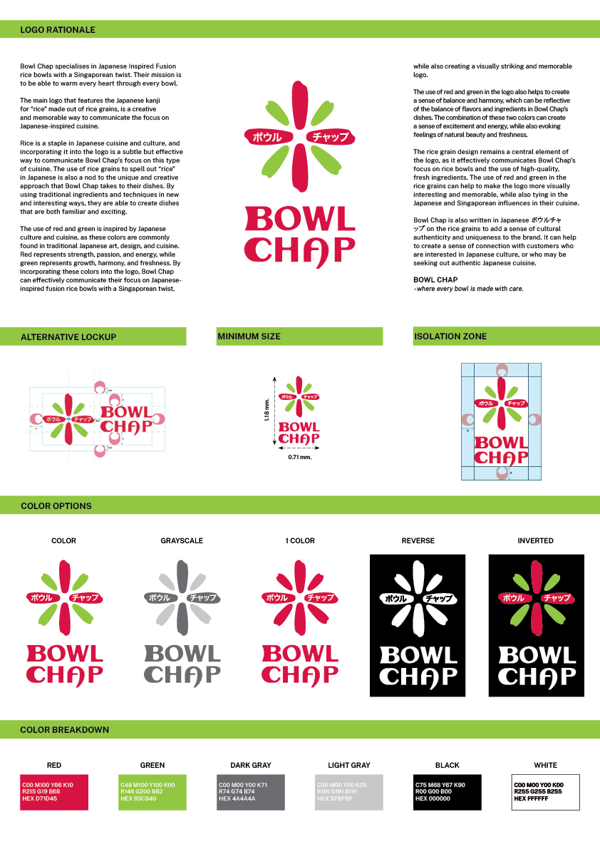
I created comprehensive logo guidelines to maintain consistency and brand integrity. These guidelines outlined the logo's correct usage, colors, proportions, and clear space. The need for such guidelines arose to ensure a unified and recognizable brand image across various platforms and applications.
Consistency in logo usage fosters a strong brand identity, allowing customers to easily identify Bowl Chap's offerings amidst a crowded market. By providing clear instructions on logo placement, color variations, and minimum sizes, the guidelines ensured that the logo would always appear at its best, preserving the brand's essence and making a lasting impression on audiences.
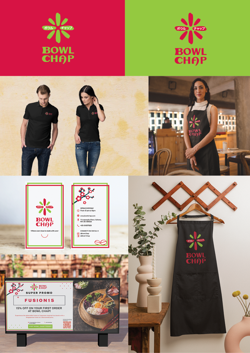
I showcased the effective use of the logo on various livery items to create a cohesive brand experience. The logo guidelines were applied meticulously to name cards, staff uniforms, and aprons, ensuring consistent branding across all touchpoints. The logo's placement and size on these items were carefully tailored to maintain visibility and readability.
Billboard advertising further showcased the logo's versatility, adapting it to larger formats without compromising its impact. The strategic application of the logo on livery items reinforced Bowl Chap's identity, fostering brand recognition and leaving a lasting impression on customers, both in-store and out in the public sphere.