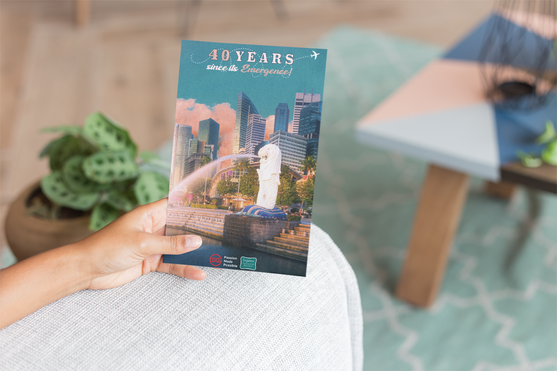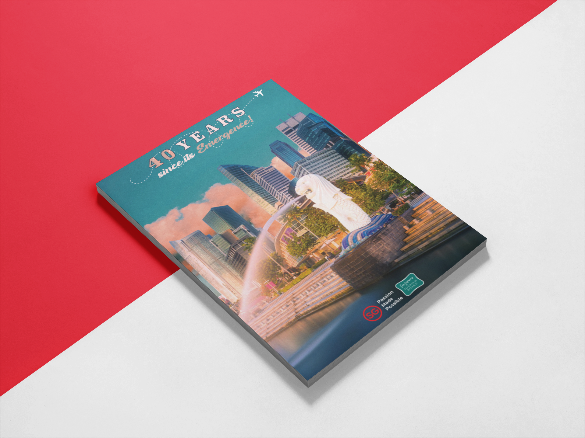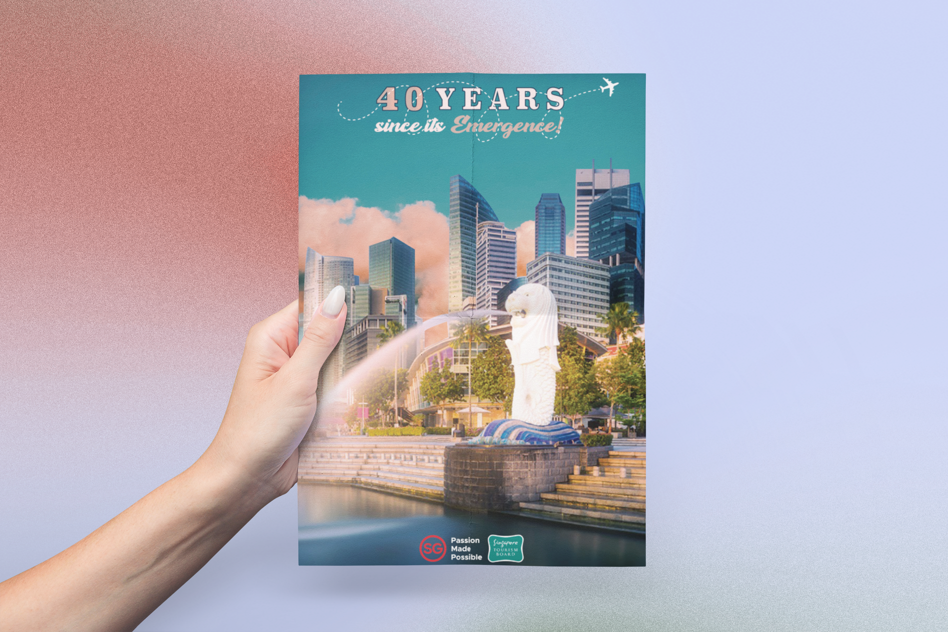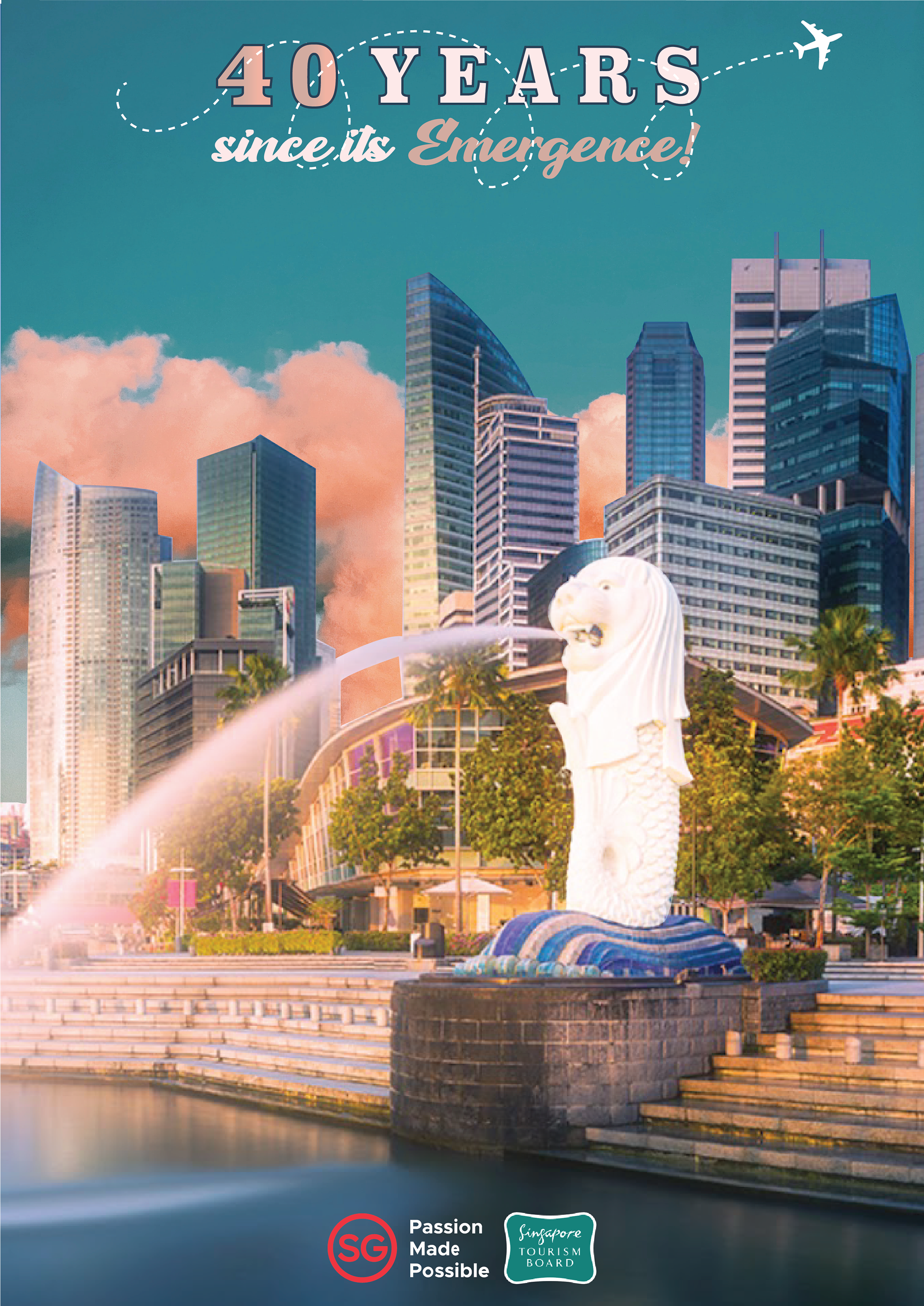
ARTWORK RATIONALE:
The flyer was meticulously crafted by utilizing various design techniques to achieve its desired aesthetic. The intention was to evoke a hazy and dewy atmosphere, which was accomplished through careful execution.
To enhance the composition, the clouds were carefully extracted from another image and incorporated as a reflection in the water, creating a visually captivating effect. The iconic Merlion was masked and enhanced, ensuring it takes center stage as the primary focal point.
Employing a bold and bulky typeface, the phrase "40 years" demands attention, while the remaining text, "since its emergence," adopts a more fluid and graceful style, establishing a clear text hierarchy. To signify progress and movement toward the future, a trail intertwines amidst the text, culminating in an airplane silhouette.